July 9, 2021
UX Benchmark: what are the trends for banking websites?
Following our sectoral studies on e-commerce and transportation, we chose to analyze UX in banking for this third Benchmark.
We have carried out user tests on 10 desktop and mobile banking sites among the main actors in France, in order to identify the best practices in the sector and the main pain points for users.
Here are the 4 major trends coming out of the study.
Ratings as a function of positive feedback from users
Trust is at the core of the banking user experience
- Starting with the home page with the chosen colors
- In the detail and the clarity of the information given on the products
- The ability to contact a human operator when needed
- Or simply the display and correct working of different elements
Cross-cutting views to facilitate navigating the site and understanding it
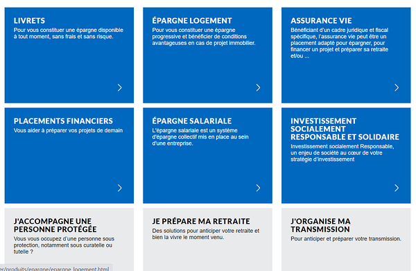
The banking world and the various products are not easy for users to understand. They need an overview so that they can easily visualize and compare different services. Having the key elements of an offer on one page, having to go back, then click on another offer to compare it, is tiresome for the user and does not help them quickly absorb the essential information to make his choice.
One page combining all the products with a brief description and a table of comparisons facilitate the experience.Personalization to plan more easily
In order to help the user better understand complex products, the simulator is now a must.
To increase its value and go beyond the table of comparison, offering a simulation of several saving products at the same time is truly a bonus to guide the user to the right choice.Ease of access to the main services
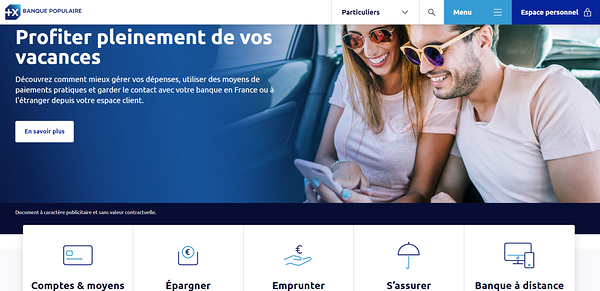
Starting with the home page, users must immediately understand the products and services that they will be able to find. Excessive classification of the different products in sub-categories makes them less visible and accessible for users.
With clear wording and presence right from the first part of the home page, or through the principal menu, users should be able to access to different saving products by a single click.
Banque Populaire's home page
Your UX project for your internet or mobile website?
To go further:- Consult a concrete example of a UX study in the banking sector with our customer Crédit Agricole
- Contact us directly or by phone at +33 1 76 40 00 15
All articles from the category: User research | RSS


