April 28, 2015
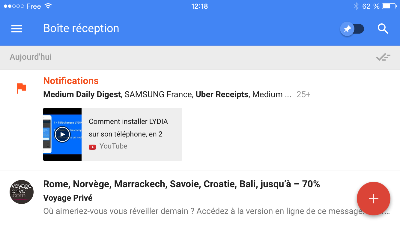
Our community tested Inbox, the new app from Google
Before proposing the app test, we installed it and did a small in-house test. You can discover other usability test examples on our customer case hub.
To conclude, we asked our community to compare Inbox with their current mail app and here is the result:
After a few days of use, here is what we felt about the app :
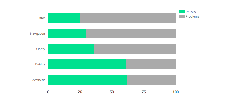
- Difficult first steps: Inbox shows an innovative way of displaying compared to what we are used to seeing from our mail app. It's refreshing but makes it hard to manage on the first use.
- Categories are unclear: the app is structured with categories that tie in activities (travel, purchase, finance, forum, notifications), it is not simple to understand the logic behind it when you start using Inbox.
- The menu is too complex: it is made of different filters (categories, without categories, done or waiting), which complicates navigation.
We thought that a large majority of feedback would be about those topics and rather negative when we started the test of our community.
However, users had very different feedback from our first impressions about the app. Inbox received a large number of positive feedback according to testing standards (44% when average on our platform is 17%).
What users liked about inbox
- Fluidity: synchronization and categorization functions are particularly fluid and useful according to users.
- Design: Inbox uses color codes and icons a lot to signal different categories. Testers praised the quality of ergonomics and design that are both bold and brilliant for a mail app.
"On the homepage, keep the fast and colored interface with pre-visualization of files"
- Filters by categories: creation and classification of categories are also praised by users.
"Classification of e-mails in the different categories is fast and easy"
What users don't like about inbox
- Tutorial: it shows the app in general terms but doesn't give enough details on how to use it.
"On the tutorial, the page should be interactive as if we were in the app"
- Search function: users would like to have more filters in order to increase search possibilities.
- Customization: there is a strong demand for more customized features with more color choices, possibility to delete default categories or new search filters.
"On the homepage, delete some useless functionalities or give the possibility to hide or delete them for the client"
To conclude, we asked our community to compare Inbox with their current mail app and here is the result:
70% of them prefer Inbox over their current mail solution!
All articles from the category: user testing | RSS


