June 19, 2019
Error management: a complete UX design guide to help your users survive through errors
We all make mistakes. So, UX design must deal with them! Yuna Orsini from Poool.tech shares her thoughts on this subject, which is too often overlooked.
Mistakes are an inherent part of the user experience.
And yet, in companies, they are often treated as rare events that do not go beyond the scope of technical development, or at least, as exceptions that do not represent a major issue for teams to deal with.
Error management is not often a key issue…
At Poool, we take the lead in admitting responsibility: after focusing our energy on a major redesign of our flagship product (the Poool Access dynamic paywall and on the design of new products in the last few months, it was high time to start optimizing our error management on the editors' dashboard.
Not handling mistakes is a mistake (*ba dum tss*)
But, surprise, the world is far from perfect and users are human. When digital products are made of processes and algorithms, their users have goals, desires, knowledge, skills and especially contexts of use that are anything but binary!
Humans VS Machines
Adopting a user-oriented approach to re-think the error management of a digital product allows for overall UX improvement.It implies considering that a user path is not always a bed of roses and that the team's job is to identify possible obstacles and then help the user overcome them.
In fact, error management is one of the 8 ergonomic criteria for the assessment of user interfaces, from Bastien and Scapin (1993).
Hey, but what is a mistake, really?
It is necessary to differentiate mistakes caused by human action from errors caused by the system.Human mistakes
As per the works of Reason (1990) and Sternberg (1996), human mistakes are classified in two categories: "mistakes", which are conscious, and "slips", which are unconscious. Mistakes concern errors in the definition of the objective to be achieved or mistakes in the choice of the means to achieve it. Slips, concern errors in the definition of the objective to be achieved or mistakes in the choice of the means to achieve it.
Not everything goes as planned
Simply put, the difference is in the person's intention. The person first intends to act. Should this intention not be appropriate, then it is a "mistake". If the intention is appropriate but the action does not go as planned, then it is a "slip".Mailchimp's interface gives us a concrete example of work on "mistakes" and "slips". When I click on the "Create list" button, the tool prompts me to use another feature, "tags", which may be better suited for my objective... Mailchimp therefore anticipates a mistake — most likely a common one in their statistics - by offering another means of action to reach the objective.
Management of a "slip" type error on Mailchimp
"System" errors
Regardless of the cause, be it an unforeseen user action or a temporary product failure, I call them "system" errors because they are less business related and more technical in nature.
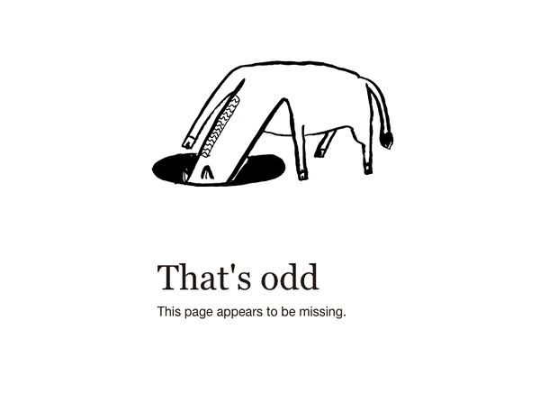
The 404-error page, again from Mailchimp
On the web, status codes characterize responses to server requests, hence most of the errors that can occur. You know those "500 Internal Server Error" pages? Unauthorized access, wrong request, out-of-time request, conflict, internal error, unavailable service... Even their name makes them less human: they use technical terms that give the feeling that the user can't do anything with them!
The wonderful human-system blend
Mistakes are not necessarily either strictly "human" or entirely "system".
The mistake comes from a user/product interaction
Technical errors often come from a user's action. For instance, I can ruin my website if I delete content that is essential to its operation in the back office.Some human mistakes end up causing a technical error identified by an HTTP code. For instance, if I try to edit a content in a tab, which has been deleted in another tab, I may find myself fully blocked by the system that prevents me from editing unavailable content without being told.
There are also errors that are considered to be human mistakes, but which are only true errors because the system was implemented in a certain way.For instance, if I try to fill in my French date of birth in an English form that has not been designed for a simple entry via a datepicker, there is a good chance that I will make a human mistake by switching the day and month of birth! It's not really the system's fault, it's not really the user's fault either, but the two don't understand each other and the primary objective is not met.
A date of birth field that seems definitely simpler to fill in with no mistakes! Jason Ford
We're not going to blame the user for an error, especially if it's not his fault! Finally, I find that the best question to ask ourselves is not who caused the error, but rather what can be done - and how - to solve the problem.
Ultimately, the most important thing is to inform if and how the user can take action to resolve the error, whether it comes from the system or from his own actions.
Error design is possible
Being unable to carry out their action, users experience huge frustration. If they are also blocked, if they don't understand why and if they can't find a way out, the situation then becomes critical and turns into a real UX problem. Like any component of the user experience, the error is designed.Designing the error before it happens
A first UX job can be done to prevent errors.For example, this is especially true on form areas that are a major source of errors and annoyance for users. Following are some tips to improve UX by avoiding the most common errors:
- Suggestion. For example, provide shortcuts or auto complete in a search field to avoid misspellings in the search expression.
Google search suggestions
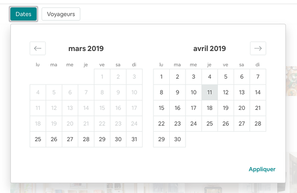
- Constraint. Put a strict input frame such as a datepicker component in a date field to ensure its correct format.
Airbnb range picker
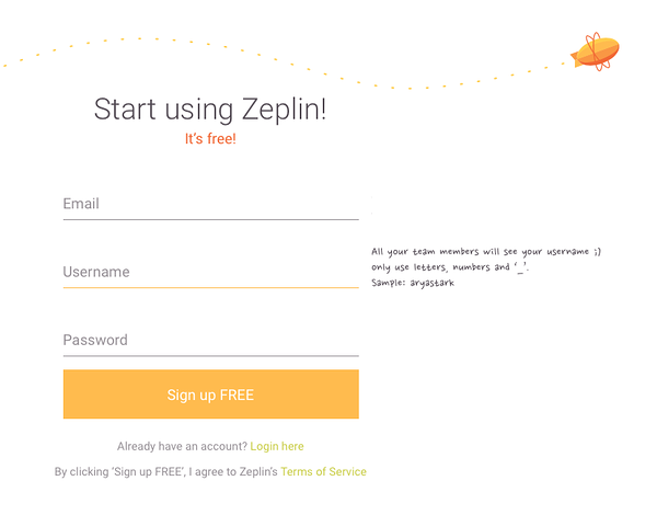
- Communication. Clear labels and placeholders in a form to guide the user in filling in his information and avoid misunderstanding or data formatting errors.
Zeplin's subscription form
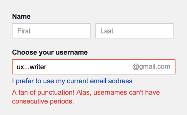
- Validation. Control of the field at the time of entry to be able to correct a typo or a data format problem, effortlessly and before sending the form
The very funny validation of the email field by Google
- Affordance. Make the design itself communicate how it can be used to guide the user. For example, work on the clickable aspect of a button to make the user want to click on it.
An image inside my Medium article: at the line break, a small "+" button appeared and made me want to click on it to insert this image
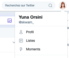
- Convention. Use navigation and interaction models that are already common in digital media. They are already known and mastered by users and reused, they simplify the handling of a new tool.
By clicking on my Twitter profile picture, I *believe* that I will probably find my personal settings and account information there
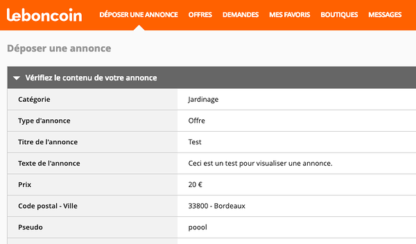
- Preview. Provide access to a preview of the content entered before the final validation in order to give the user the possibility to make corrections before submitting the form.
Leboncoin allows you to view a summary of your Ad before its publication
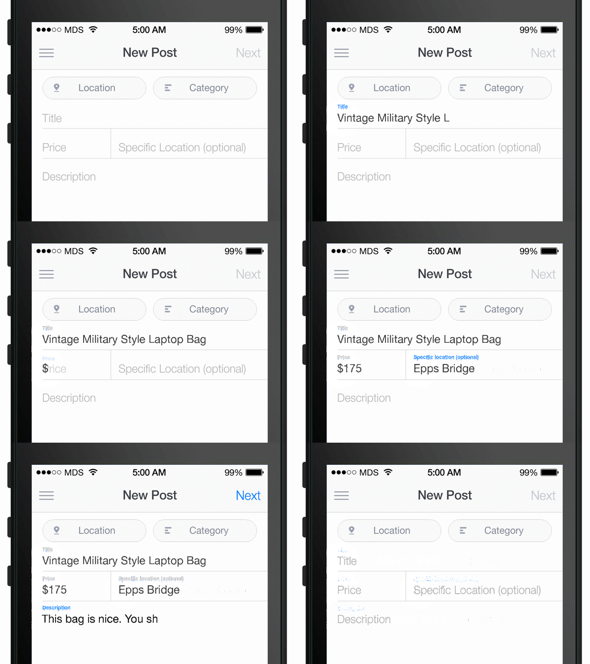
- Reminder. Remove as much as possible those moments when the user has to remember information to finalize the process Floating labels labels are an example of a simplified solution on the memory side: when clicking in the field, the placeholder is positioned as a floating label so as not to lose the information to be entered.
The original floating label pattern by Brad Frost
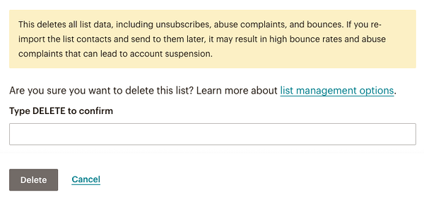
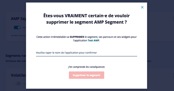
- Confirmation request. Before definitely applying a key action, ask the user to confirm his request. For example, when deleting an item, this allows the user to avoid the frustration of having lost valuable content by mistake.
Mailchimp asks for confirmation of deletion by requiring the user to enter the
word "DELETE"
- Warning. When the system detects that an error is likely to occur, warn the user so that he is aware of it and adjusts his use. Examples of warnings are the character counter on Twitter or the registration suggestion warning.
On Twitter, a character counter warns that the tweet you're writing is about to reach its maximum length
- Ability to Cancel. Giving the user the ability to cancel an important action in order to undo a potential error.
Gmail allows you to retrieve an email for a few seconds after it has been sent
Designing the error response
When everything has been done to prevent the error, but it still occurs, a response has to be designed: the error message.It is said that a good error message mut be polite, accurate and constructive. Jakob Nielsen adds that it must be visible, make it easier to correct the error and, even better, educate users at the same time.
Mistakes and learning
Clarity and relevance of the error message
- The Error Symptom: what really happened?
- The Error Cause: why did it happen?
- The Error Solution: what can the user do to solve it? And if the error solution does not depend on the user (for example system error), when will the situation return to normal?
What can/should the user do to solve this error?
- Proper location and size: place it visibly and easily readable without breaking the user's workflow when performing the task. For example, in a form, opting for "inline" validation is often a good idea to quickly indicate which field is affected by the error.
- Relevant colors: choice of colors is crucial to convey a message. But beware for accessibility reasons, color should not be the only vector of this information! At Poool, we are used to design our components according to the colors of our customers. For the Form widget, however, we decided to use black as a neutral color, to ensure that the reds, oranges and yellows, often used in the branded media universe, are not included in the form fields and interpreted as errors by the readers.
Yellow and red are often the main colors of media or their premium articles. Therefore, we could not take the risk of using this color as the error message or field outline color.
About brevity
In fact, while Nielsen's First Law of Computer Documentation states that people generally do not read it, the Second Law states that, actually, they only read it when they have a problem and that they are especially attentive when they want to correct an error. As such, Nielsen even encourages the use of error messages as educational resources to bring new knowledge to users!
A UX + dev + design collaboration to review our error management
We had already implanted several systems to prevent errors or misunderstandings:
Shortcuts to thematic support articles in each section of our Dashboard
A built-in information bar for "guest" users who are limited in their actions
A modal to confirm the will to delete an important content
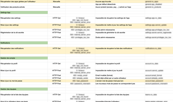
But it became essential to work as a team on the problem of error messages. Our CTO, Ugo, started by making an accurate listing of the errors that could occur on our Dashboard. The idea was to know the type of error and its potential cause as exhaustively as possible. This resulted in a table of 114 potential errors.
A built-in information bar for "guest" users who are limited in their actions
A modal to confirm the will to delete an important content
A shared document to simply list all possible and imaginable errors
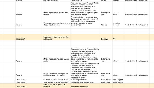
As you can see, the approach at that time was still very technical. It was essential to understand the process, but it was obvious that it was now necessary to work on popularizing these errors and pass them "in user language". So, for each error, my job was to understand whether it was a user-induced error, a system-induced error, or both, and what the user's options were for dealing with it. This would have an obvious impact on the error wording, which was then to be carried out. At this stage, it was possible to name the error, explain the cause and put forward tangible solutions to reduce the comprehension/correction effort as much as possible.
At the same time for each error, I defined its ideal location: is it a form error to be processed next to the related field? A recording error for which you simply have to repeat the action? An overall error that prevents the use of the dashboard?
I used the same shared document to work on the wording, location and solution of each error
Finally, the last step was to work on the visual dimension of error messages. 3 issues were at stake:
- Make error messages visible and readable
- Distinguish the notion of system error experienced by the user even though he did not ask for anything, from the error caused by the user for which he has to perform a corrective action in his own workflow
- Expand our Poool brand environment
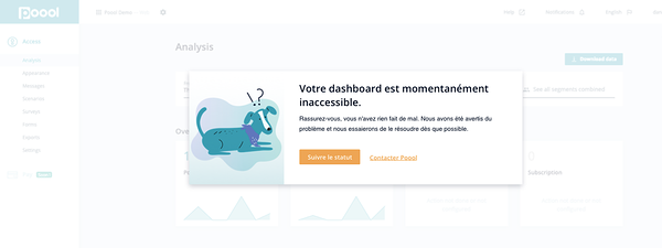
Daniela, our design manager, has (among other things) worked on an illustrated approach that perfectly met these 3 challenges.
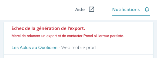
A reassuring popover that makes you smile and allows for quick action
A white haze on the popover background may be necessary if the system is totally blocked
The character of the little dog is expressed in several postures.
At the same time, form errors were also worked on. They already existed, but they now include possible solutions and a gateway to Poool's help. Certainly, one less point for brevity, but one more point for clarity!
A white haze on the popover background may be necessary if the system is totally blocked
The character of the little dog is expressed in several postures.
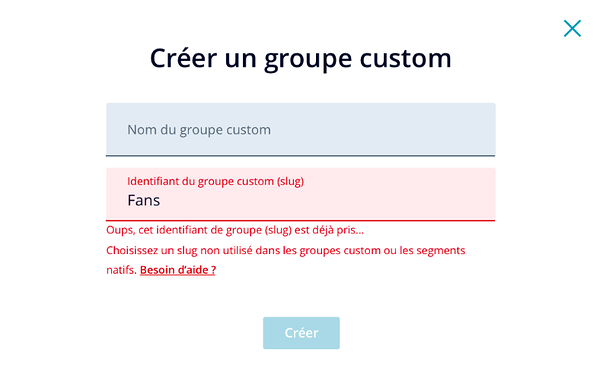
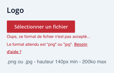
Field errors are clearly indicated next to the relevant field and offer a resolution path and the gateway to help
This was done for the 114 errors listed. This work is a first proper step towards meeting the needs of our users, although it can obviously be extended and improved in the future!
In conclusion on error management and UX design
Work on error management will not magically remove errors. Nevertheless, this work acts on the error perception. When the error is clearly announced, simply explained, even with a little humor if the situation allows it, and finally offers simple solutions, then the user will be less unhappy to endure this problem!Some articles mention turning the error into a "delightful" moment. I wouldn't go as far as that, but I would say that the challenge is at least to turn the frustration into a controlled situation and why not take advantage of it to get a message across to users, immersing them in a brand universe, and even educating them. In short, let's consider error management as a component of UX, that is rich, alive and with great potential!
This article was first published on the Medium page of Yuna Orsini or consult our UX audit service page.
All articles from the category: User research | RSS

