April 7, 2015
The challenges of seducing users in a mobile first world
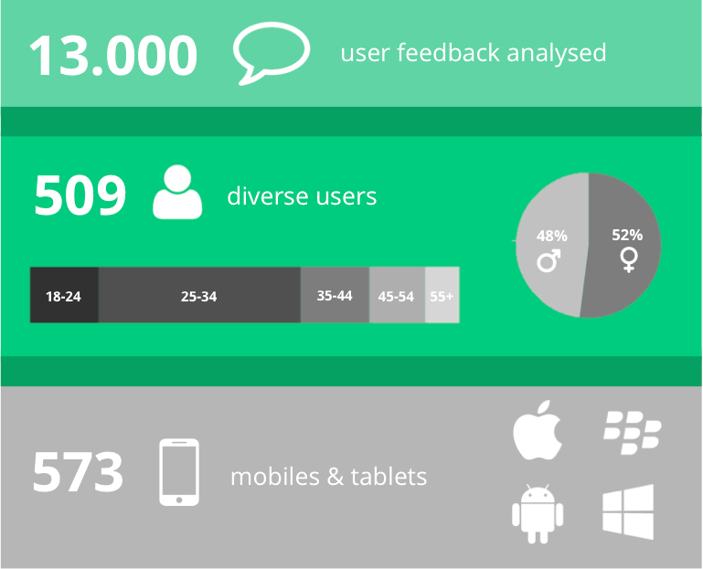
We analyzed more than 13.000 user feedback from 509 users who explored dozens of websites and mobile applications on smartphones and tablets. Looking at the results, we came to a few surprising results in 3 areas: functional, user experience (UX) and seduction.
1. Functional challenges
Responsive is the big thing
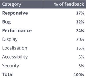
The top 3 functional barriers for users are clearly identified: responsive, bugs and performance. Yet, responsive issues are already the highest source of frustration with the number of screens configurations.Account is the most critical feature
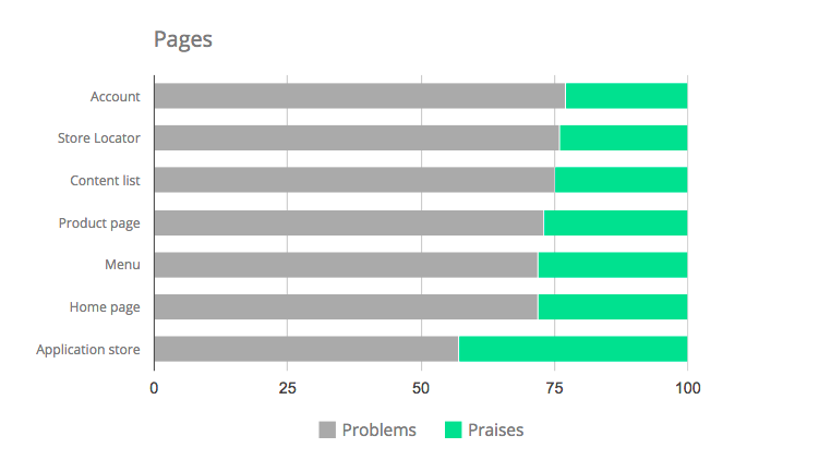
If sites and applications had places like stores, "account" and "store locator" would collect most of the negative feedback. This leads to clear areas of attention when building and testing. On the other hand the Application store description (AppStore, Google Play, etc) is the place that generates the most satisfaction, a testimony to recent efforts regarding Application Store Optimisation (ASO).
2. User experience challenges
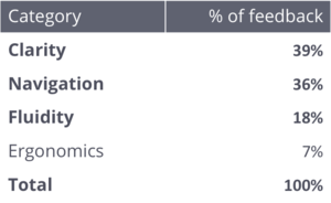
Key barriers are clarity and browsing
A deep dive into UX shows how users are first and foremost frustrated with clarity and browsing. The issues usually appear with a lack of hierarchy or through information overload - sometimes both - on our mobile screens (including tablets).
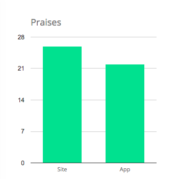
Websites in general receive more praise than mobile application. Surprised? In our research the difference is explained by a well-understood domain as there is lot of experience in building websites.
Websites in general receive more praise than mobile application. Surprised? In our research the difference is explained by a well-understood domain as there is lot of experience in building websites.
3. Seduction challenges
Seduction, a mix of offer and aesthetics
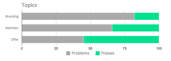
The emotional part of our research called Seduction is the key source of satisfaction. Despite all the functional and UX barriers they have to overcome users are seduced by websites and applications value proposition. This is driven by both aesthetics of visuals and product/service offer.
There is more potential for the current offer on websites and applications
Whereas aesthetics calls for progress, the offer presented on websites and mobile applications is the highest source of satisfaction of our research with 55% praises vs. 45% problems reported.
Last but not least...
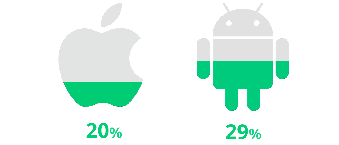
One last thing, as would have said Steve Jobs, let's compare the two major mobile operating platforms, iOS and Android. Android users are 50% more satisfied than iOS users. Please leave us a comment and give us your best guess as to why.
All articles from the category: Design | RSS
